
Website Best Practice #2: Ensuring Seamless Website Navigation
When it comes to website design, good navigation is an essential element of creating a seamless user experience. Your website is your digital shop front, so it needs to be easily accessible and browsable. In the real world people entering your physical store would expect clear navigation on where to find certain products, where to pay, and be able to find everything displayed neatly and clearly. The same applies to your digital shopfront.
A well-structured and intuitive navigation system allows visitors to effortlessly explore your website, find the information they need, and engage with your content. In this blog post, we will delve into key strategies and best practices to ensure good navigation on your website, helping you create a user-friendly and easily accessible space
Keep things simple!
When visiting your website, users don't want to be bombarded with too many options. Start by simplifying your website's navigation structure. Aim for a clear and concise menu that avoids overwhelming visitors with excessive options. Categorize your content logically and group related pages under relevant headings. Use descriptive and easily understandable labels for menu items, ensuring they accurately represent the content within.
Prioritise important pages
Identify the most important pages on your website and make them the first thing your customers see. Consider your visitors' goals and lay your website out accordingly. Ensure that essential pages, such as the homepage, products/services, about us, and contact information, are easily accessible from any page on your site.

Consistency is key!
When your customers are navigating your website, it's important that they can access the navigation bar in the same place every time. Place your primary navigation menu in a prominent and consistent location across all pages. Most websites position it at the top of the page or in a sidebar. Avoid changing the position or style of the navigation elements, as this can confuse users and impede their ability to navigate your site effectively.
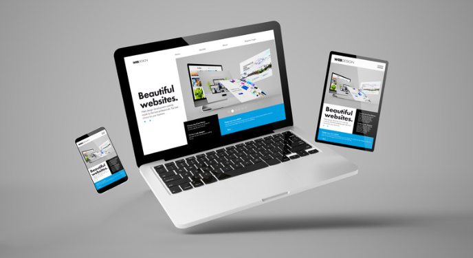
Optimise for mobile users
With the increasing prevalence of mobile browsing, it is crucial to optimize your website's navigation for mobile devices. Implement responsive design techniques to ensure that your navigation menu adapts seamlessly to different screen sizes. Consider using a hamburger menu or an expandable menu to save screen space and enhance mobile usability.
Incorporate search features
Search helps your users get to the content they need with ease. Including a search bar prominently on your website provides users with a convenient way to find specific content. Make sure the search bar is easily noticeable and accessible from any page. Enhance search functionality by integrating autocomplete suggestions, filters, and advanced search options to help users refine their queries.

Monitor site performance
Keep a close eye on your website's navigation performance. Use tools like heat maps and click-tracking software to understand how users interact with your navigation elements. Identify any areas of low engagement, high drop-off rates, or usability issues. Continuously monitor and fine-tune your navigation based on user behaviour to make your website experience the best it can be!
To conclude...
A well-designed and intuitive navigation system is essential for a successful website. By simplifying and organising your navigation, prioritising key pages, optimising for mobile and incorporating search functionality, you can create a seamless and user-friendly browsing experience. Regular testing, feedback analysis, and performance monitoring will enable you to continuously improve and refine your navigation, ensuring visitors can effortlessly explore your website and find what they need. Invest time and effort into creating an intuitive navigation structure, and you'll lay a solid foundation for a positive user experience and increased engagement on your website.
Discussion (0)
Join the conversation and share your insights with our community
Join Our Community
Share your expertise, ask questions, and engage with fellow CPD professionals
Start the Conversation
Be the first to share your thoughts on this article. Your insights could help other professionals in their CPD journey.